01
Data Visualization

-
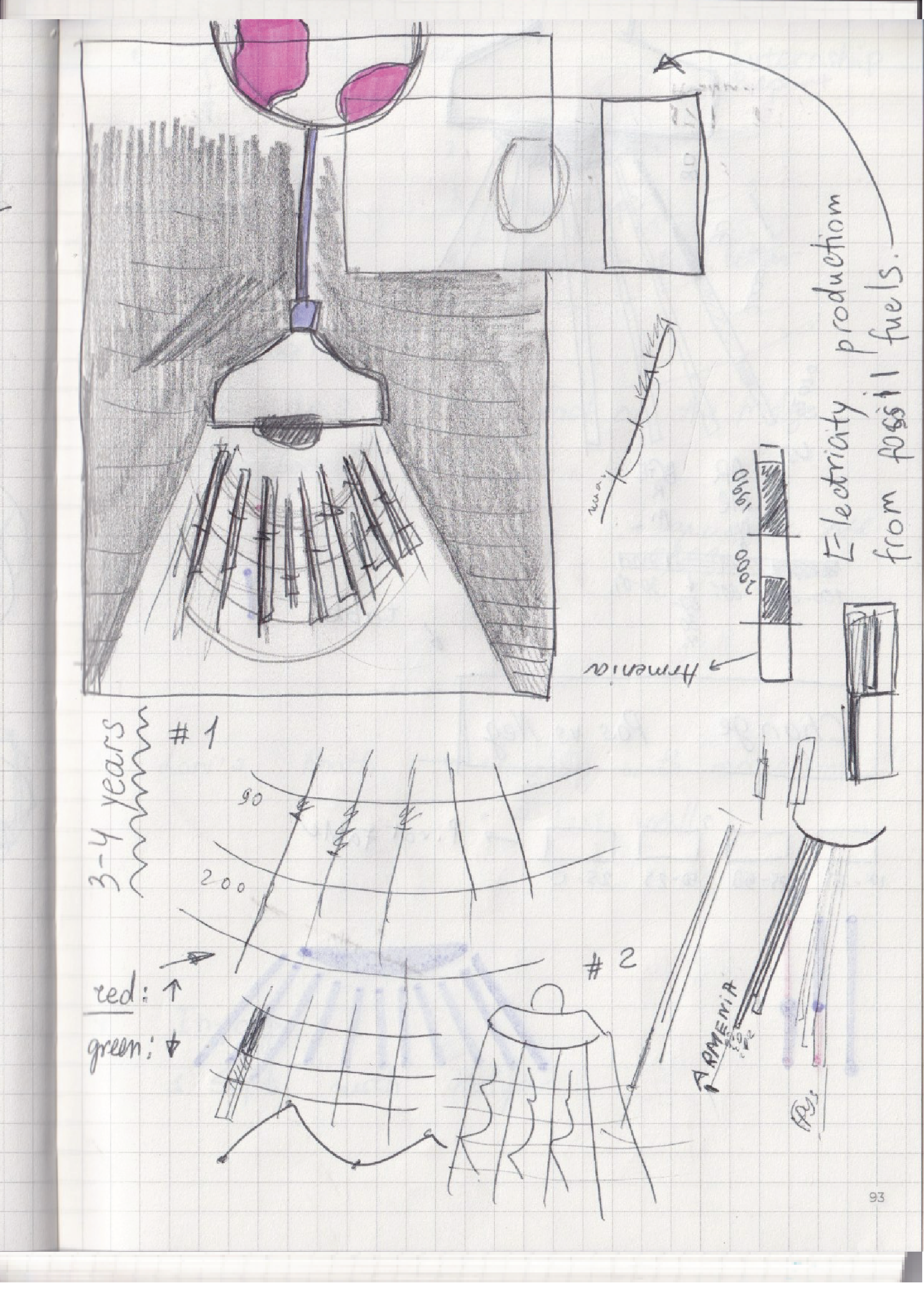
The purpose behind any diagram is to present data is a more accessible form and to highlight possible insights. In this case I was studying global trends in electricity production transition from fossil fuels to renewable sources using data from World Bank.
How can we present complex energy production data in and engaging and visually appealing form that attracts an eye and offers enough detail to stay and explore?
How to transform hundreds of data points into an easy-to-grasp form?
-
This is a data visualization project that transforms World Bank energy statistics into engaging infographics, showing how different countries and regions are transitioning from fossil fuels to renewable electricity over time.
-
This is an educational-style diagram designed to be displayed in museums, websites, or printed media targeting teenagers who like popular science.
02
Solution
I researched available global energy production data and found a dataset which spanned all geographies across four decades. I decided to stylize the diagram following the electricity theme - with a lamp shining a bright light beam on a black background. In order to make the numbers easy to understand at a glance I chose to use color coding for value ranges. The diagram colors were selected for intuitive recognition: orange brown for heavy fossil fuel reliance reminds of earth and flame whereas blue for high renewable energy percentage associates with clear sky. Using specialized software, I created a custom radial diagram that displays energy source transitions by countries and regions, layering in historical data points to show
changes over time.
Roles
Tools
• MS Excel Enthusiast
• Infographics Designer
• Illustrator
• Visual Storyteller


Digital World


Social Media

03
Brand Guide
Insight
I am fascinated by infographics—the magic of converting numbers into a visual stories. During my first year Illustrator classes I developed a strong interest in clean, linear icon design. This project was the combination of two.

Diagrams, Data


Typography


Colors

Details


My Sketches and Ideas
04